Page 2 of 3
Re: New Rebel Ship
Posted: Mon Dec 07, 2015 11:15 am
by Gencool
Sleeps - I'm fairly sure most ships have gradient overlays to help make them feel more 3D. Colour picking / bucket filling rarely works for me perfectly.
Maybe they just painted black on the ships and left some old paint showing?
Also, I think the cyan/teal colour on the Elite ships would look badass on black. Like, just an elite ship, but black where it's usually orange.
Re: New Rebel Ship
Posted: Mon Dec 07, 2015 1:08 pm
by Gencool
WAIT WHAT - the Kestrel Adventures beat me to it!
Re: New Rebel Ship
Posted: Mon Dec 07, 2015 6:02 pm
by Turbo_Scrooge
stylesrj wrote:That's more of a brown than orange.
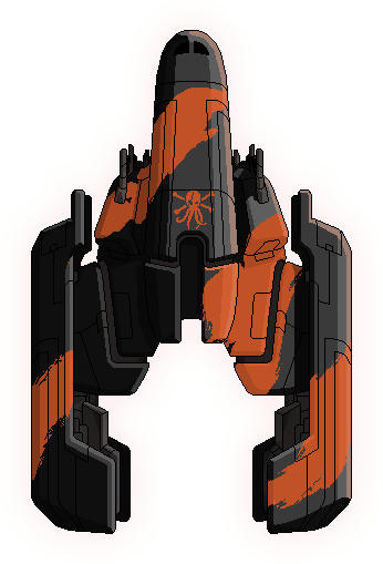
How's this?
That looks good. How do I give it the white-and-grey checkered background?
Re: New Rebel Ship
Posted: Mon Dec 07, 2015 6:05 pm
by stylesrj
Gencool wrote:WAIT WHAT - the Kestrel Adventures beat me to it!
I was wondering if those ships should be put into CE. Might make for a Bounty Hunter or an elite force more elite than the Elite Fighter.
Turbo_Scrooge wrote:That looks good. How do I give it the white-and-grey checkered background?
???
The checkers mean that part is transparent?
Re: New Rebel Ship
Posted: Mon Dec 07, 2015 6:16 pm
by Turbo_Scrooge
Yeah, because I thought if it didn't have the checkers and I put it into superluminal, it shows up with a black background. Am I wrong?
Re: New Rebel Ship
Posted: Mon Dec 07, 2015 6:36 pm
by stylesrj
So does it have a black background when you throw it into Superluminal? Because it doesn't when I do it.
Re: New Rebel Ship
Posted: Mon Dec 07, 2015 6:38 pm
by Turbo_Scrooge
Wait nevermind

I was putting it through my tablet first. =)
Re: New Rebel Ship
Posted: Mon Dec 07, 2015 7:04 pm
by Sleeper Service
Gencool wrote:Sleeps - I'm fairly sure most ships have gradient overlays to help make them feel more 3D. Colour picking / bucket filling rarely works for me perfectly.
Yeah, I had a discussion with taxi service whether this really improves ship graphics. I tend to disregard gradients on custom ships. I mean you can always get around it by color selecting with a higher thresholds. I usually pick colors from the middle of surfaces to get the average color. But you are right, it makes a pretty big difference.

I don't know, I think it just looks more crisp without gradients. (overall more contrast?) The vanilla gradient can be roughly reproduced though. (colorizing the ship with a fixed palette and then using some high transparency black airbrush with a big brush-size along the edges of the ships that are technically in the shade.) But simply shifting the hue might be overall easier, its just hard to hit the original color range exactly...
Re: New Rebel Ship
Posted: Mon Dec 07, 2015 8:45 pm
by mr_easy_money
stylesrj wrote:That's more of a brown than orange.
Ah, I see. Didn't realize how brown it came out. I wasn't really sure what OP was looking for...
While OP agrees with the bright orange, I was thinking that maybe it should really be in somewhere in between;
the original pirate ship by sleeper service seems to be a faded red, not a bright red: a worn out pirate ship
your bright orange seems to give off more of a newly painted pirate ship.
and I do say, you probably did a better job in colorizing...
Re: New Rebel Ship
Posted: Mon Dec 07, 2015 8:51 pm
by Gencool
Colourise, and type in the hue value, maybe?
Or even just use a block of the colour you want, and set the blend mode to hue/colour...
Have to admit, I'm a sucker for subtle gradients.
Use 'em in everything, me.